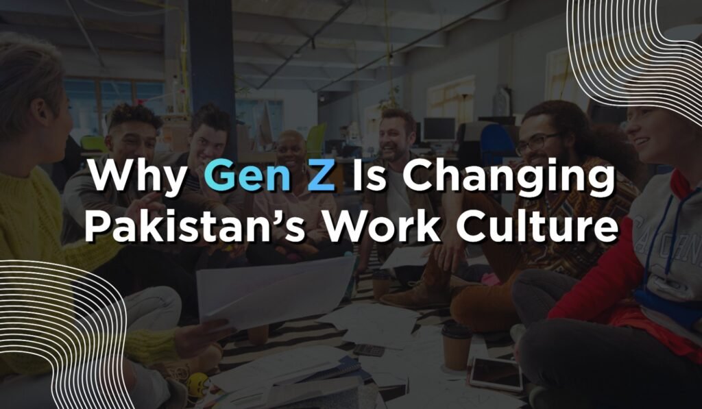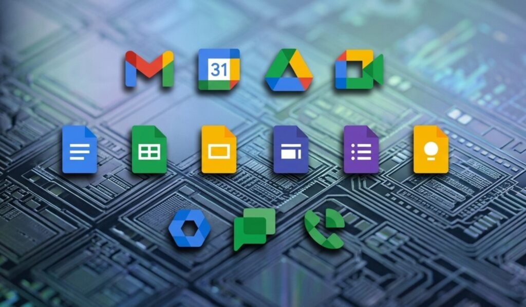
Google is rolling out a major gradient redesign across Gmail and other Google Workspace apps. This update marks one of the biggest visual changes in the productivity suite so far. The new design spreads across all major apps in the ecosystem.
According to sources familiar with the rollout, the redesign follows two main goals. One focuses on a stronger app identity. The other aligns the visuals with Google’s AI direction. The gradient style already seen in apps like Gemini, Maps, Photos, and Home now expands across Workspace tools.
A major shift is also the removal of the old four-color rule. Earlier, every icon had to include all Google colors. That approach is now gone. Apps now use cleaner color choices and more distinct shapes. This helps users tell apps apart more easily.
Another change is the reduction of icon containers. Many apps no longer sit inside boxed frames. This allows larger symbols and clearer visuals. It also gives each app a more individual identity instead of a uniform look.
Gmail Returns to a Strong Red Identity
Gmail keeps its envelope shape but with softer edges. The design feels smoother and more modern. Red remains the main color. Small hints of yellow, green, and blue are still present.
Unlike other apps, Gmail is the only one that still reflects all four Google colors. This keeps it visually connected to the broader brand while still giving it a stronger identity.
Drive and Editor Apps Get Structural Changes
Google Drive now uses a rounded triangle shape. The design is less sharp and more curved. It uses green, yellow, and blue. The red tone is removed completely.
The change keeps Drive connected to Docs, Sheets, and Slides. At the same time, it gives it a cleaner and more modern feel.
Google’s editor apps also get layout updates. Docs remain like a vertical page. Sheets and Slides now switch to a horizontal format. This matches how spreadsheets and presentations are used in real work.
Meet, Chat, Calendar, and Tasks Receive New Visual Styles
Google Meet gets a major redesign. The camera icon stays, but yellow becomes the main color. The reason for this color choice is not fully explained.
Google Chat now features a softer message bubble design. It includes a small smile-like shape. Green is used again, linking it back to Hangouts branding.
The calendar moves back toward a classic flip-style look. The container design is removed. Blue returns as the main color, giving it a more traditional identity.
Google Tasks uses a simple button-like shape with a checkmark. The focus is on completion and clarity. The design stays minimal but more defined.
Keep, Forms, Voice, and Sites Get Updated Designs
Google Keep now highlights the light bulb icon. The background is removed. This makes the bulb more detailed and visible. The focus stays on idea capture.
Forms drops its paper-style look. It now uses multiple choice bubbles. Purple remains the main color. The design feels more modern and structured.
Google Voice becomes more rounded. It keeps its calling function but looks softer. Forms of green match Chat in tone.
Google Sites shifts to a lighter blue. The horizontal layout reflects desktop web usage. It feels more open and less dense than before.
AI Integration Shapes the New Design Direction
The full redesign connects closely with Google’s AI push. The gradient style matches Gemini and other AI tools. It signals a more unified visual system across Workspace.
The goal is also to reduce confusion between apps. At the same time, each app gets more space to build its own identity. The result is a balance between consistency and individuality.
Google is clearly moving toward a design system built for the AI era, while still keeping Workspace recognizable as one connected suite.